APOSTROPHE
a hims + hers brand
For five years, I led the evolution of Apostrophe, turning it from a “glass skin” prescription skincare concept into a celebration of real skin and real humans. Through bold visuals, inclusive storytelling, and a trusted voice, I redefined what it means to connect with diverse audiences authentically. I created high-performing digital creative and inclusive and effective product designs to bring users through our funnel and ultimately lasting patients of Apostrophe.
Area of Focus
Creative Strategy/Direction + Design
Year
2019-2024
Website
apostrophe.com
Tools used
Figma, Adobe Suite, Capture One, Google Analytics, Klaviyo, Unbounce, Notion, Asana
Services
Styling, branding, web design, product design, user research, digital marketing, email marketing, production, SEM and product launches
Branding
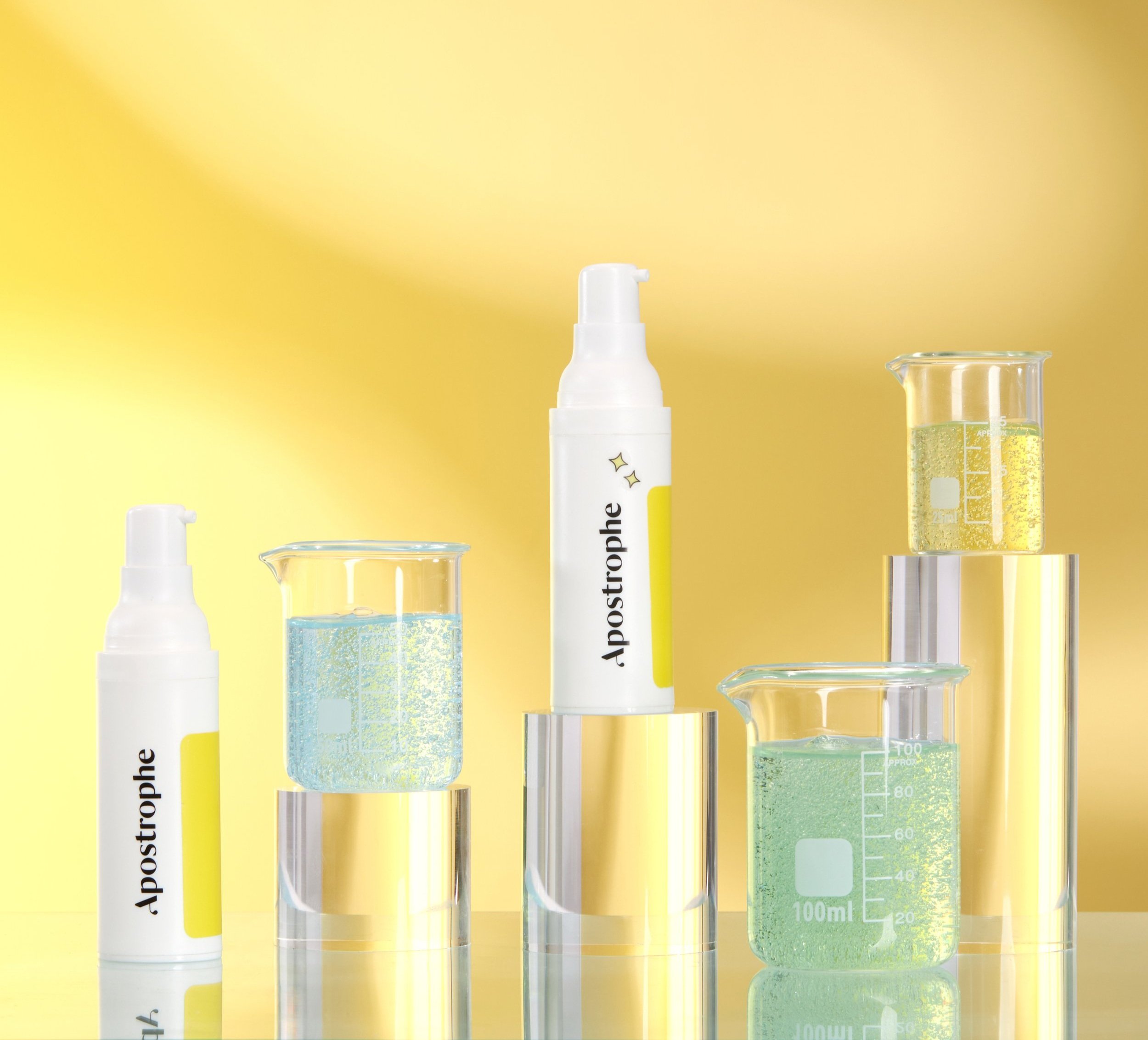
With Apostrophe’s mission in mind, I created a branding refresh that speaks directly to our audience. We swapped a pastel color palette that felt too friendly and went with a palette that felt approachable yet expert. infusing our visuals and messaging with a sense of inclusivity, in which everyone can see themselves in. Think vibrant colors, approachable fonts, and relatable language and imagery that invites conversation rather than dictating terms.
This shift isn’t just about aesthetics—it's a commitment to becoming a brand that feels like a trusted expert and friend. With this bold transformation, we're not merely changing our image; we're reshaping how we engage and resonate with every individual. Welcome to a new era of authenticity! Feel free to check out the brand guide in its entirety on brandguide.apostrophe.com.
Email Marketing
Apostrophe’s email marketing campaigns are designed to connect and deliver results through highly personalized drip campaigns tailored to each user’s skincare journey. From onboarding to treatment updates, every email is crafted to guide users seamlessly, offering clear messaging about customized treatments, expert support, and science-backed solutions. Bold visuals, strong calls-to-action, and adaptive content ensure the emails evolve with customer needs, making skincare easy, accessible, and personal. These campaigns go beyond promoting products—they build trust and foster lasting relationships by delivering a truly customized experience.
Landing Pages
The following are high-performing landing pages that my team and I continuously optimized over five years at Apostrophe, resulting in their status as top performers.
This landing page is a revamped version of apostrophe.com. After analyzing user data and interviewing a cohort of patients, we redesigned the homepage to enhance the user experience. The updated design highlights the conditions we treat, real user stories with expert dermatologists, our product offerings, and authentic before-and-after results showcasing real people with real outcomes.
The landing page above is our SEM-focused online dermatologist page (apostrophe.com/get/online-dermatologist). Using A/B testing, we experimented with different header visuals—comparing product-focused imagery from the homepage (shown to the left) with the "phone-in-hand" image demonstrating the intake process. We also tested showcasing the conditions we treat using real people with authentic skin textures. This approach led to this page outperforming all other online dermatologist landing pages.
The landing page above is our SEM-focused tretinoin page (apostrophe.com/get/tretinoin2). Through A/B testing, we experimented with various header designs, comparing imagery of the product itself with relatable lifestyle visuals. We also tested the inclusion of educational content about tretinoin’s benefits alongside real patient results and skin transformations. By highlighting personalized treatments and real user experiences, this landing page consistently outperformed other pages in driving conversions and engagement.
The landing page above is our SEM-focused brand page (apostrophe.com/get/brand). We leveraged A/B testing to refine key elements, comparing bold brand-focused visuals with more product-oriented imagery. Additionally, we tested messaging that emphasized Apostrophe’s core values—personalized care, expert dermatology, and real results—alongside real user testimonials and before-and-after transformations. This approach led to this page becoming one of the highest-performing brand pages, driving both awareness and conversions.
Social Media
With the support of the social team and junior designers, we created some of the top-performing assets for social media, particularly on Instagram and digital advertising. We also developed an in-house influencer initiative called the “Creator Program,” which featured real patients sharing their experiences and progress with our products. Guided by my direction through detailed Instagram creative briefs, the content remained on-brand and consistently delivered high performance. By focusing on authentic skin transformations, progress stories, and educational content, we successfully grew our social media following. Check it out for yourself on Instagram and TikTok at @hi_apostrophe.
Product Design
Working closely with the product team, we improved the onboarding experience and reduced user confusion, we tested real visuals versus illustrations, ultimately choosing photos to help users see themselves in the process. We also added a "What’s Next" timeline and redesigned the account homepage to be more intuitive, friendly, and tailored to patient needs based on user research.
The Intake Form
To improve the onboarding process for Apostrophe, we focused on refining the product design through iterative testing. We conducted A/B tests comparing the use of images versus illustrations for key questions about skin type, acne severity, and affected areas. Ultimately, we discovered that incorporating real visuals—such as photos of skin conditions and relatable user profiles—allowed users to see themselves better in the experience. This approach not only increased engagement but also fostered trust and clarity, ensuring users felt more confident in sharing their skin concerns and completing the onboarding process.
The What’s Next Experience
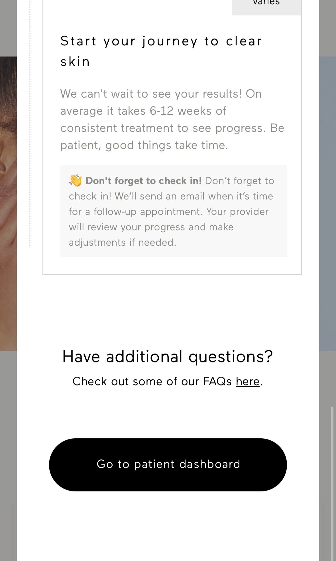
To address customer confusion following the onboarding process, we identified a key opportunity to improve communication and clarity. Many users were unsure about the status of their order or what to expect next, leading to an increase in customer support inquiries. To solve this, we introduced a "What’s Next" timeline at the end of the onboarding process, providing a clear, visual guide to the next steps once users reached their profile. Additionally, we redesigned the account homepage to be more user-friendly and engaging. Based on user research and patient feedback, we created a visually appealing layout with sections thoughtfully broken out to meet the specific needs of our users. These updates not only reduced customer inquiries but also improved the overall user experience by making the process intuitive and reassuring.
THIS AREA IS STILL UNDER CONSTRUCTION
‘Screen + Body launches are coming soon… BUT if you are looking for more, please let me know via the contact page.
THE OTHER SIDE ACADEMY
Next


